Best viewed on desktop or tablet
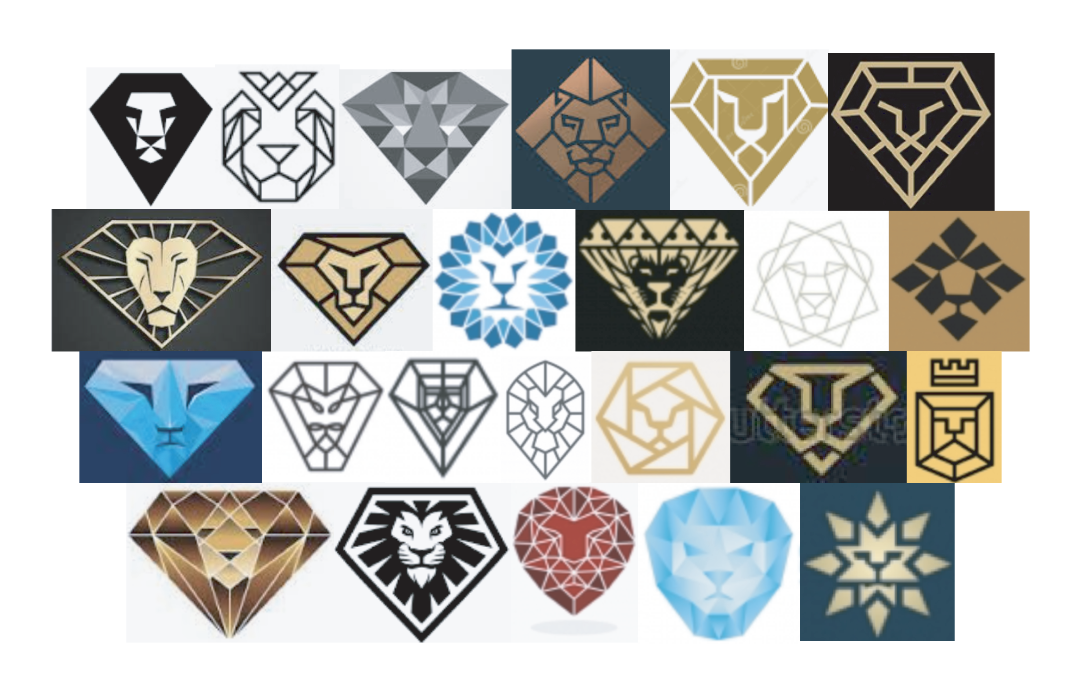
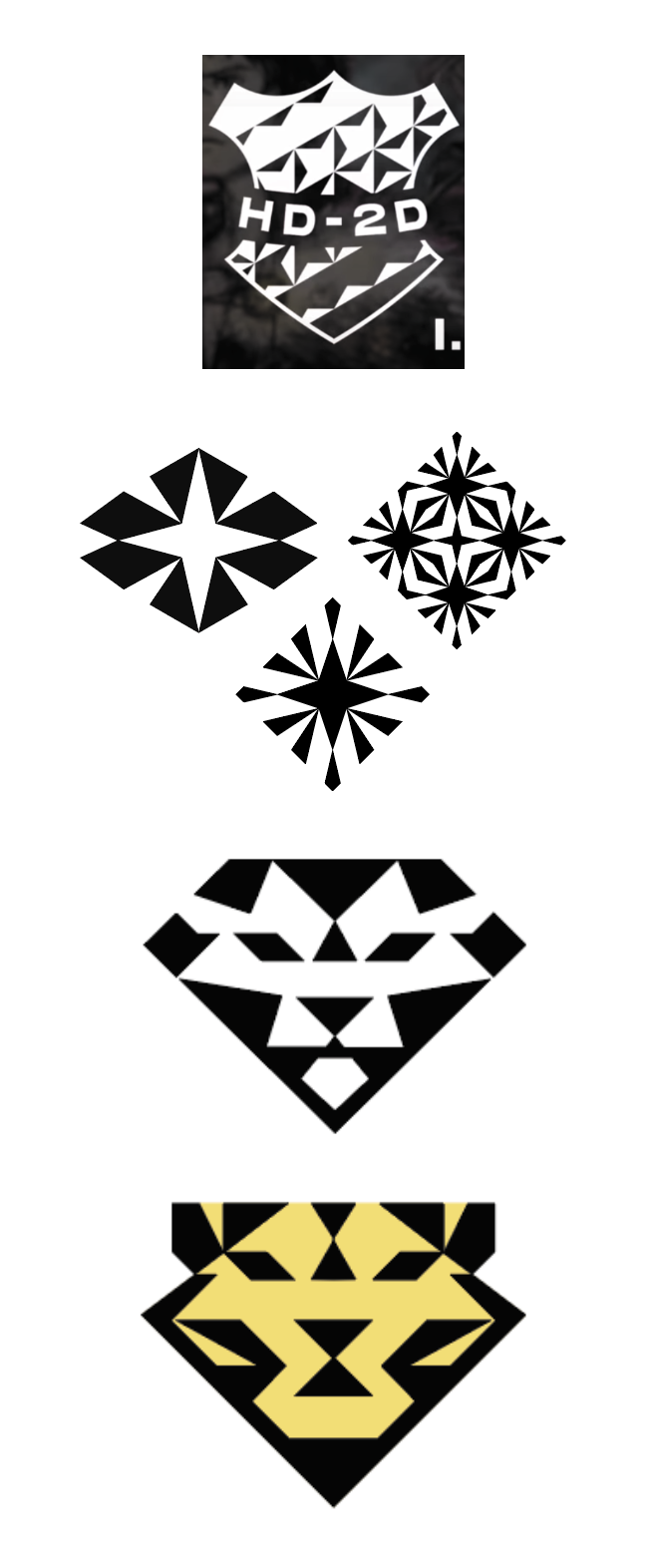
I researched existing geometric lion logos and found there was room for improvement. I could design a logo that looked like both a faceted diamond and a lion equally. It would work in color and black and white to make printing cheaper.
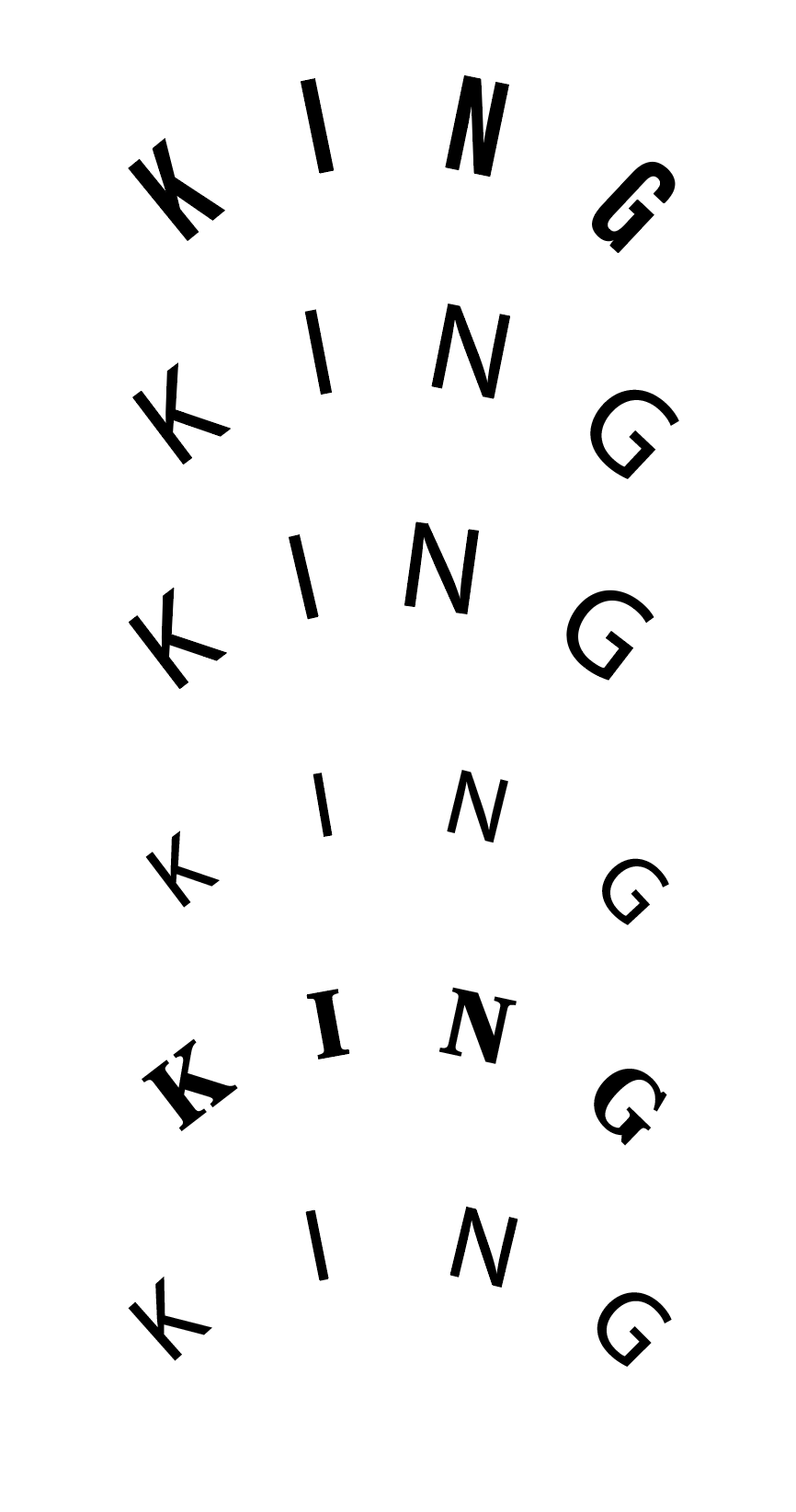
I explored fonts that complimented the geometric nature of the logo.
One logo in perticular inspired me to use negative space.
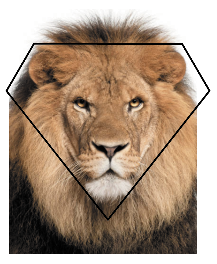
I used an image of a lion’s head and diamond shape to help dictate the shape of the lion.
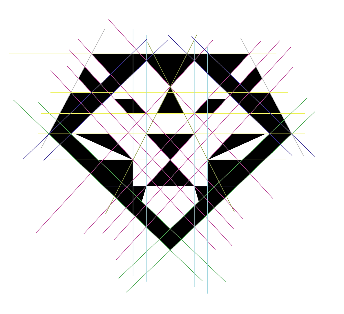
PROBLEM:
King Jewelers logo has various edges and corners that align. Changing placement and dimensions in the eye, shifted the alignment in the mouth and ears.
SOLUTION:
To make necessary modifications, I tracked down the main nexus points and focused on manipulating elements that have no impact on these nexuses.
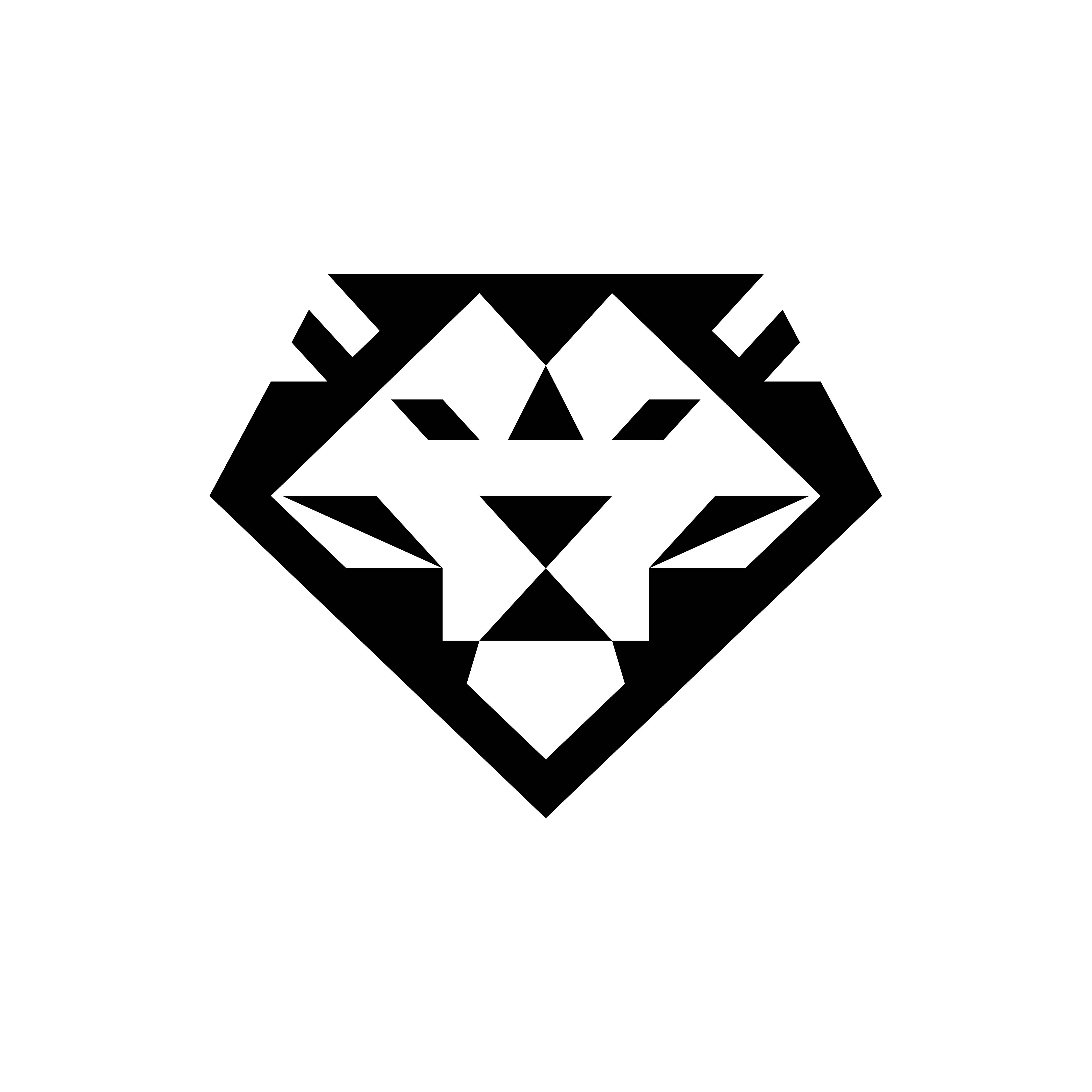
The lion’s head is meant to symbolize prestige, strength and dominance in craftsmanship. A brilliant style facet was modified for the logo because of its iconic and timeless shape.